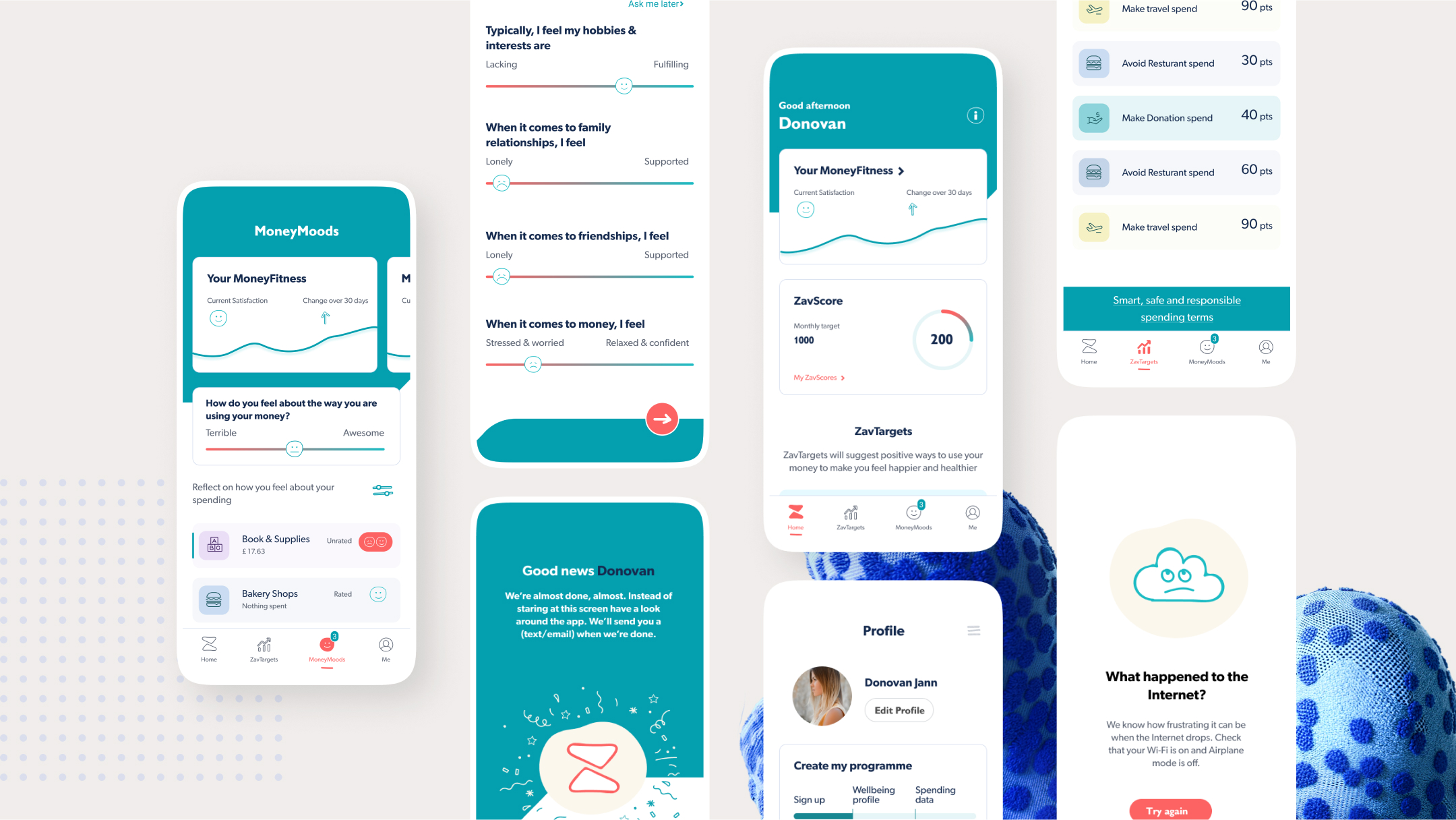
The Future of Financial wellbeing
Zavfit is a money fitness app who’s mission to make the world a happier, healthier place. How? By addressing the daily stress, guilt and anxiety that many of us feel about money.
It has a dedicated team of behavioural scientists, psychologists, AI experts and neuroscientists to guide the user to use their money in a way that makes them happy and healthy. From feeling anxious and uncertain, to confident and comfortable. From ‘why did I do that? to ‘I’ve got this’.

Problems in the existing solutions
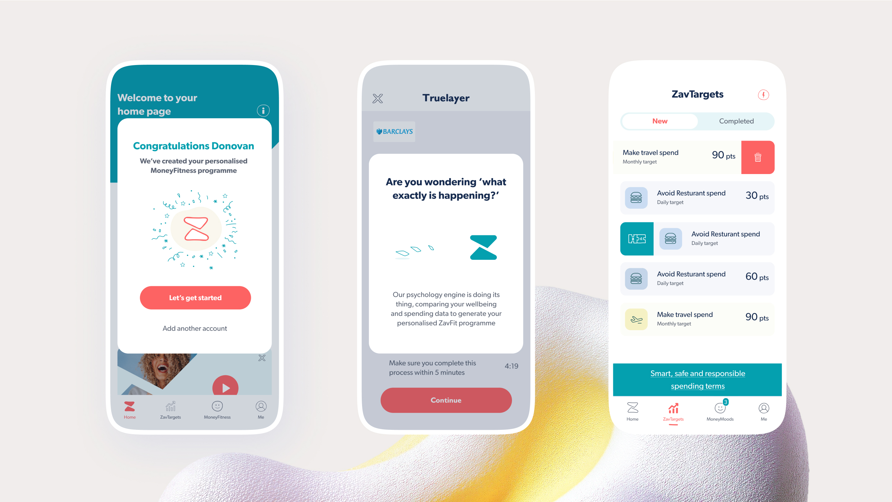
I conducted the UX audit in order to find issues with the app and to better understand the procedures involved. There is a problem with understanding the new terms used in the apps, for instance ZavScore and ZavTargets, according to the usability assessment of the old design. Following analysis and usability testing input, I discovered that the lengthy onboarding procedure prevents users from using the app and experiencing its features.
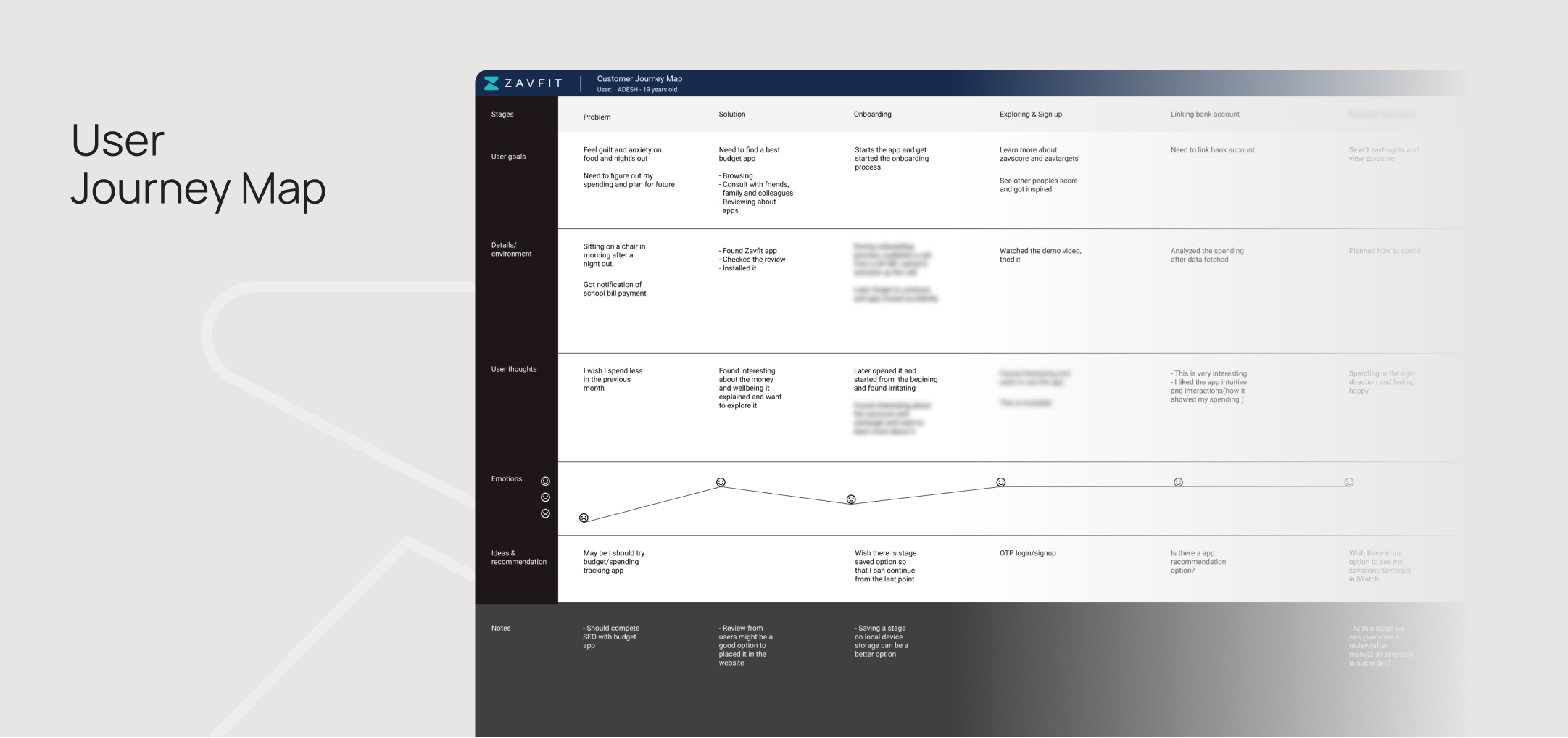
To assist the client comprehend the solution in greater detail as they previously lacked it, I prepared a user journey map.
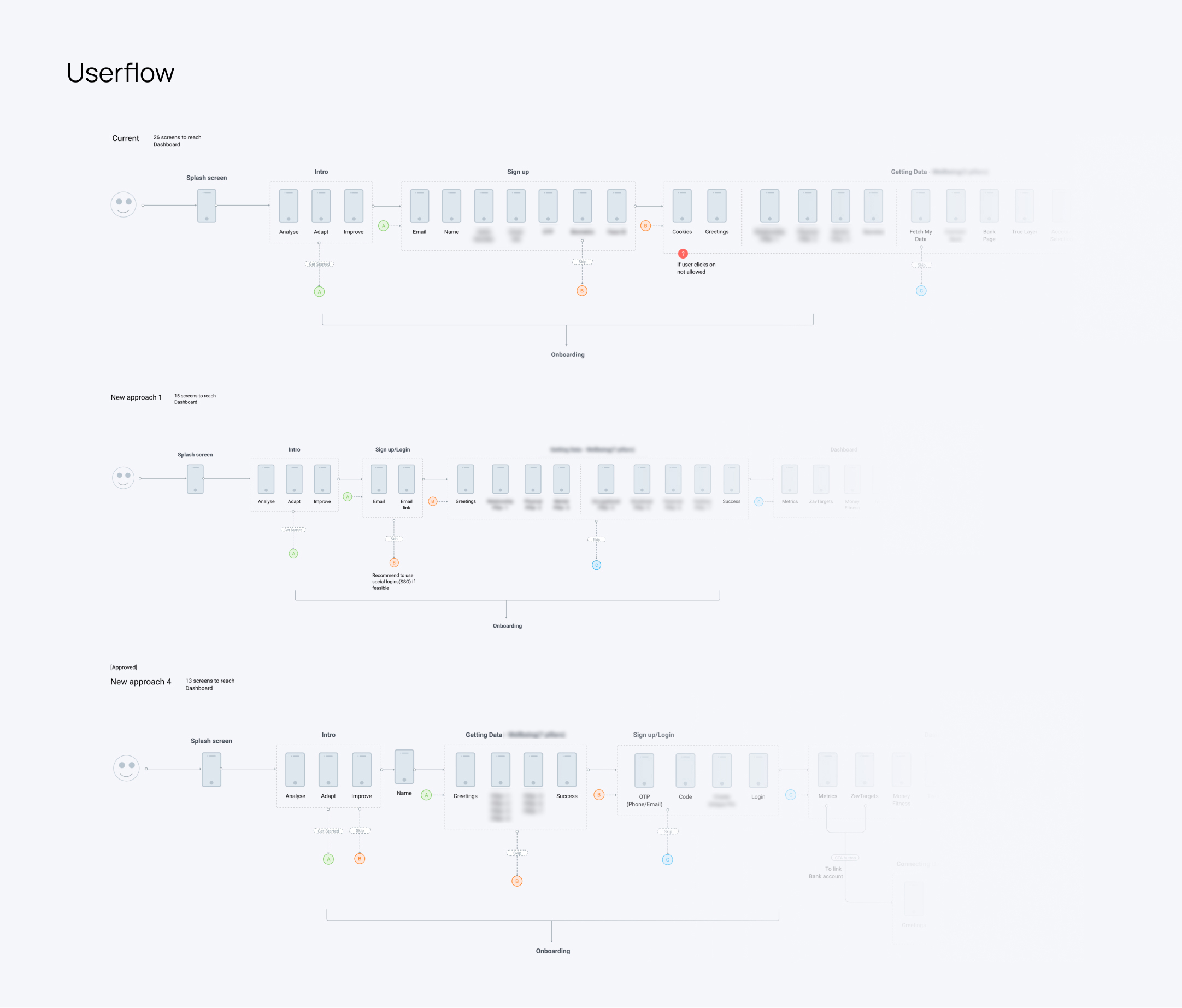
I studied the current userflow in order to create a better, more flexible userflow that
would provide a better, more efficient pathway for the users. We performed up to four
iterations in this session before settling on the best one.
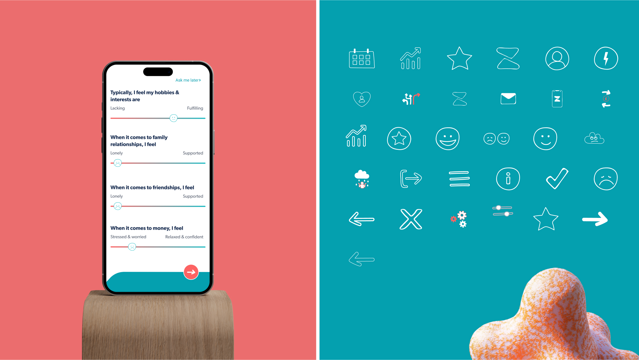
We reduced the number of
onboarding screens from 26 to 13, only including the most crucial ones, and provided
features that could be skipped. However, once users reached the dashboard, we displayed
how complete their profiles were.
