Veriwise is a Claims Management Company that is authorised to deal with Housing Disrepair Claims
Veriwise help all tenants get access to justice, so whatever the issue is with their rented property if the landlord is refusing to fix the problem/issue or just ignoring, then the tenant can simply tell the Veriwise through the application and Veriwise resolve the issue directly with the landlord/agent in legal way.

Challenges
There are 8.4 million tenants in the UK, many of whom have problems with their housing disrepair issues. Unresolved housing problems raise worry, which aggravates mental and physical health problems. Tenants view access to justice through the legal profession a costly barrier. To sovle these issues Veriwise use online simple solution for tenants to submit their claim for housing disrepair issues.
I designed a professional website with progressive easy-to-use form that the tenant may use to submit their complaints. The target user group ranges in age from 17 to 55. So I also paid close attention to accessibility.
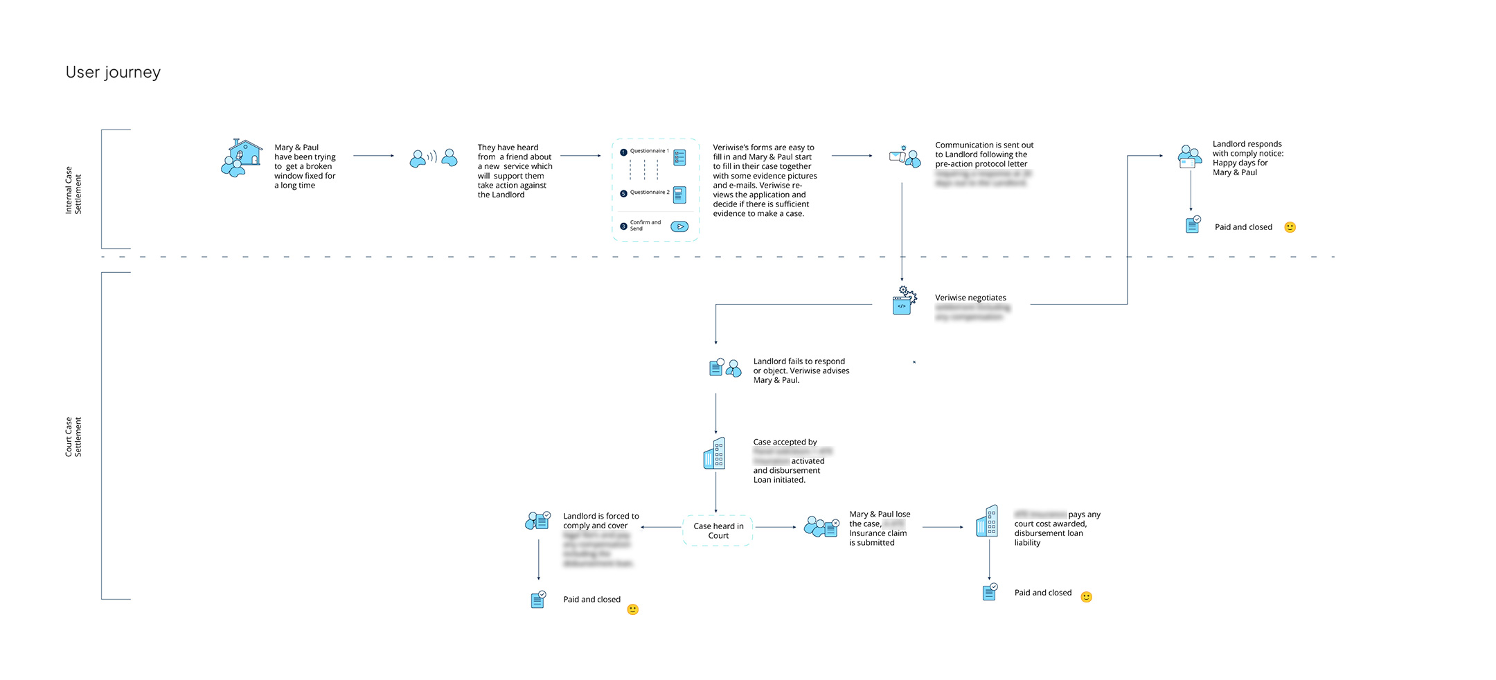
I therefore completed the user journey to comprehend the actual pathway after thoroughly understanding all of the requirements from the brainstorming session with the client. We finally settle on the above one after some iterations.
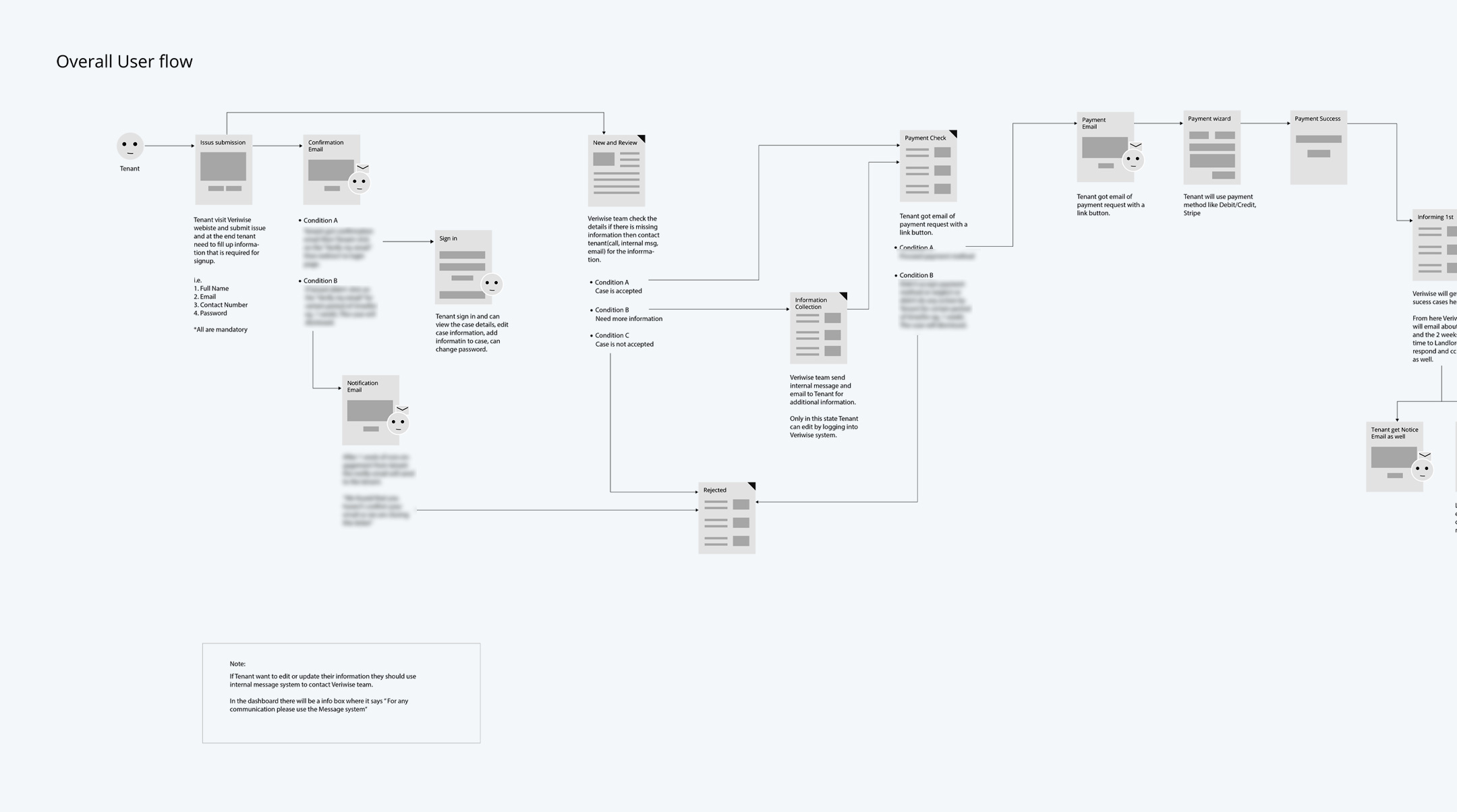
As soon as I understood the actual user journey, I dived into the userflow. My main challenge is creating an efficient automated userflow between users and administrators for the claiming procedure. The above userflow was significantly refined through numerous iterations between the client and developer.
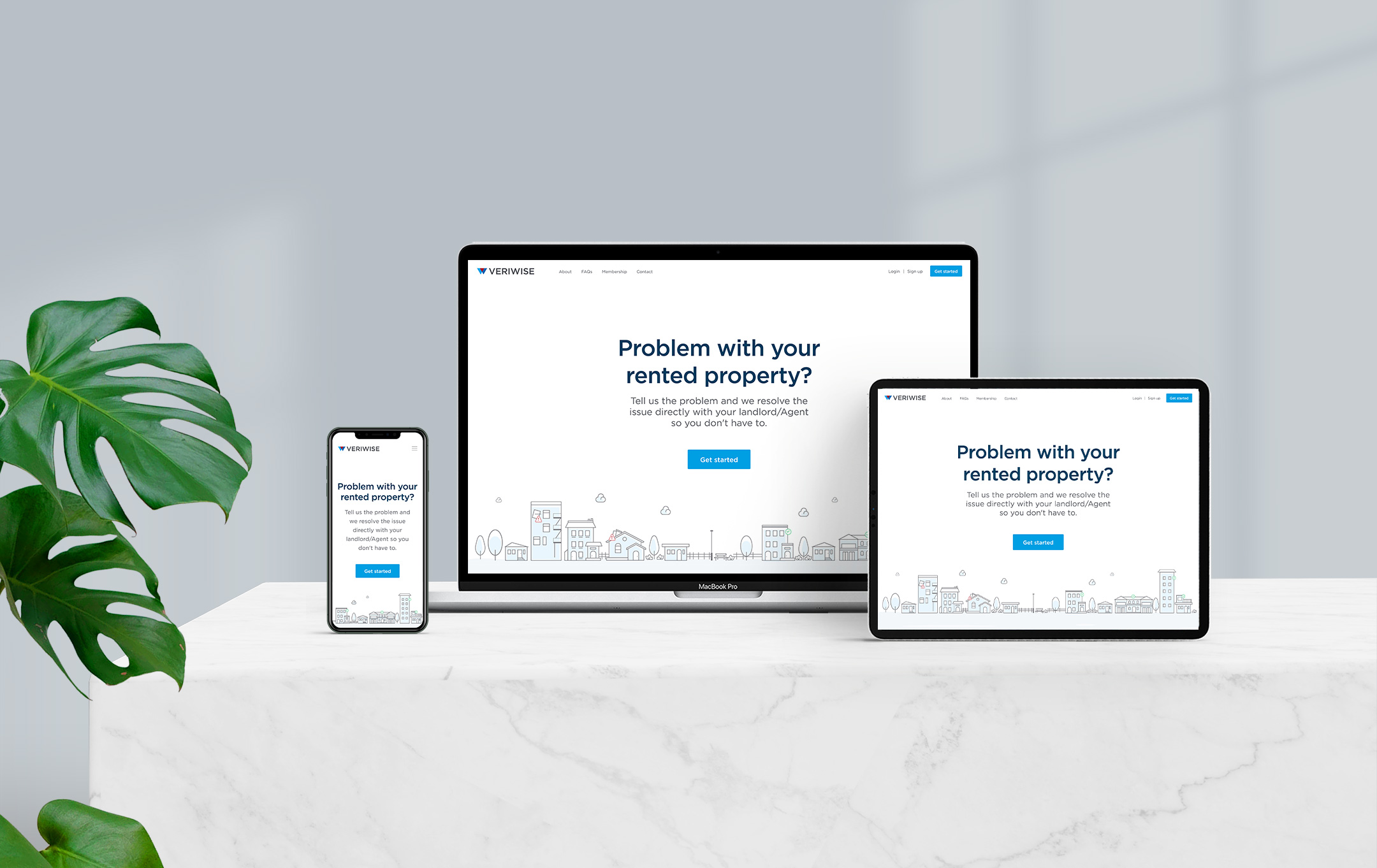
I immediately started working on the high-fidelity design after finishing the user journey and user flow. Due to the project's tight timeline, I skip the low-fidelity.
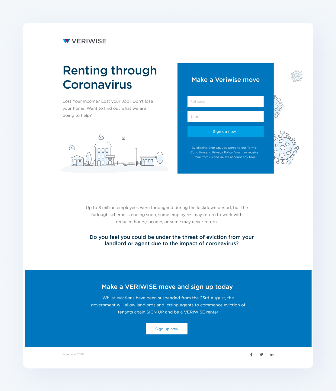
This landing page was created for marketing purposes before the launch of the product.
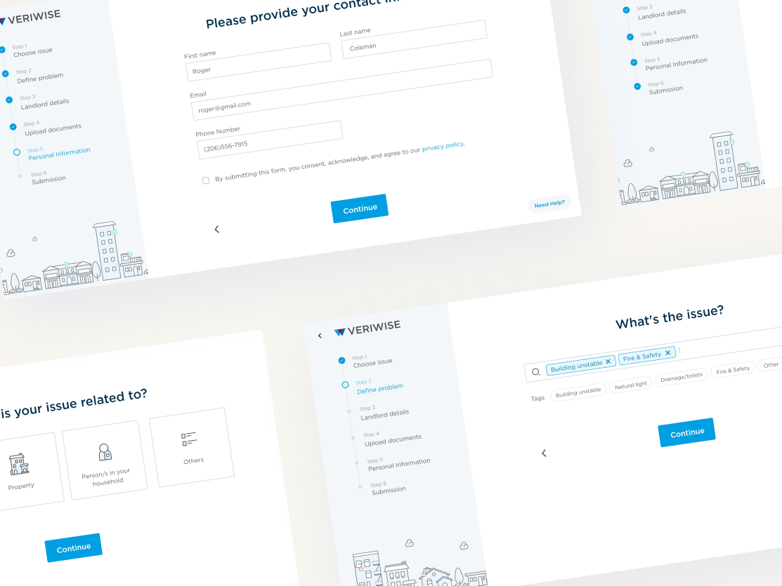
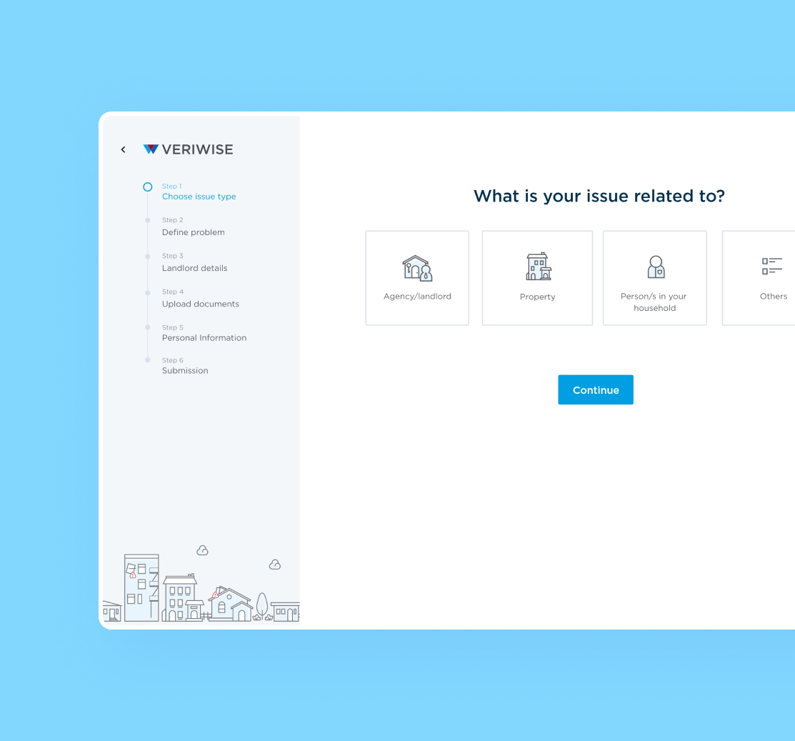
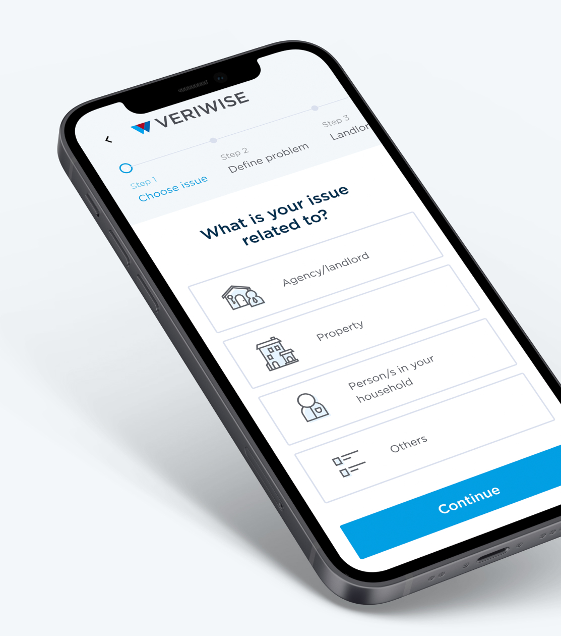
The tenant uses this claim form to address any complaints with the landlord. The tenant must go through several steps in order to complete this process, so I utilized a progressive form to prevent the user from becoming overwhelmed by the procedure. Additionally, the usage of attractive icon illustrations will make the process more engaging for users.
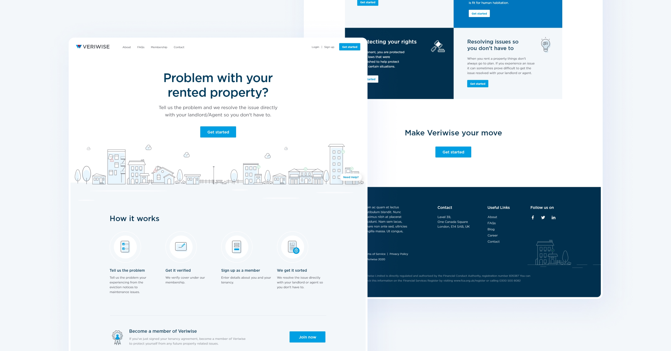
Home page of the Veriwise. I have used 60:30:10 color rule throughout the website.
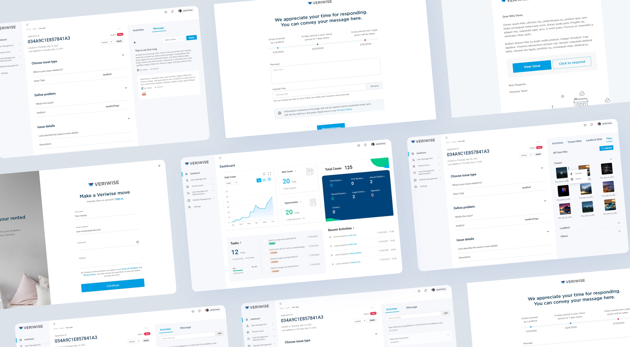
Admin Rich application
I found the most practical methods and provided cutting-edge tools for data representation in the Veriwise admin side.
