Munin provides specialized OCR solutions tailored for the finance and insurance industry. The platform for unlocking value from paper forms and unstructured data, supporting to make more timely decisions, reduce the cost of processing and provide better customer service. It is the gateway to a true digital transformation.
With the aid of machine learning, its major objective is to quickly digitize time-consuming manual scanning documents.
Challenges
Due to the fact that traditional insurance companies are modernizing and entering the digital age. They require a platform to convert their paper papers to digital format. The main role play is where OCR enters. Our key difficulty is to provide the platform where they can develop their own parser rules that can be quickly applied to a number of documents that will convert into digitalized form because the business will have a vast number of documents that need to be digitalized. UX is crucial in this, and our objective is to give every user a quick and enjoyable usability experience.
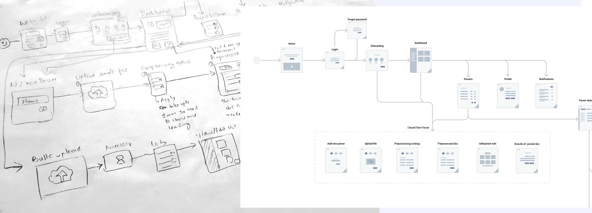
After gaining an understanding of the needs, objectives, goals, and users, I started with user-flow.
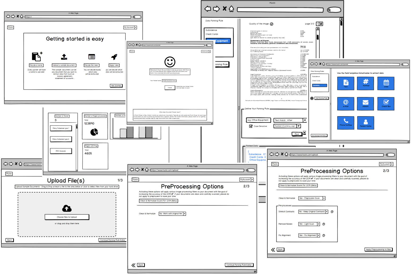
I began creating wireframes using the Balsamiq program after the user flow was complete. I mostly concentrated on the three factors of feature, functionality, and content when creating the wireframe.
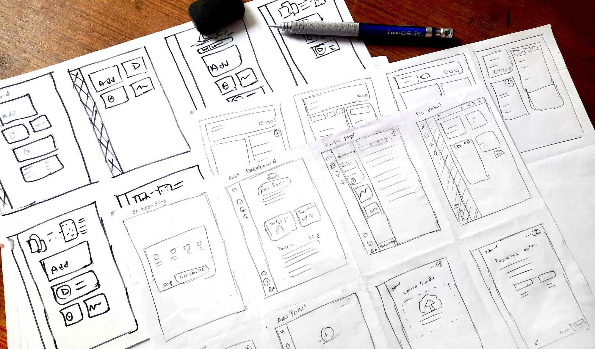
Using the basic prototype features of Balsamiq, we finally finished the wireframe after a few revisions. We internally tested the low-fidelity prototype's usefulness. After that, I started using Crazy 8s to create a fantastic layout with excellent usability and information architecture. For the dashboard, generate parser page, and parser detail page, I used Crazy 8s.
I put both categories of people in the forefront of my user interface design (first-time and regular users).
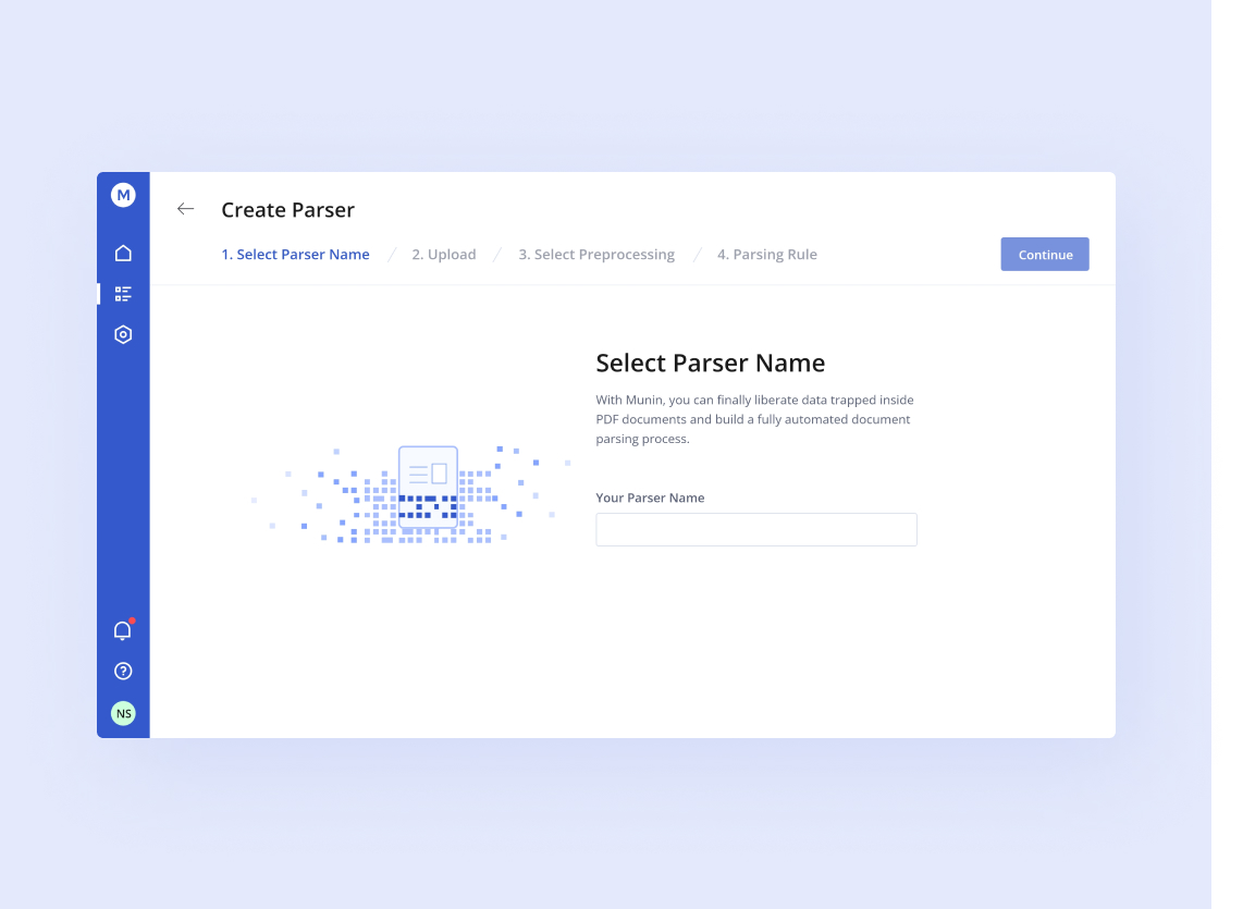
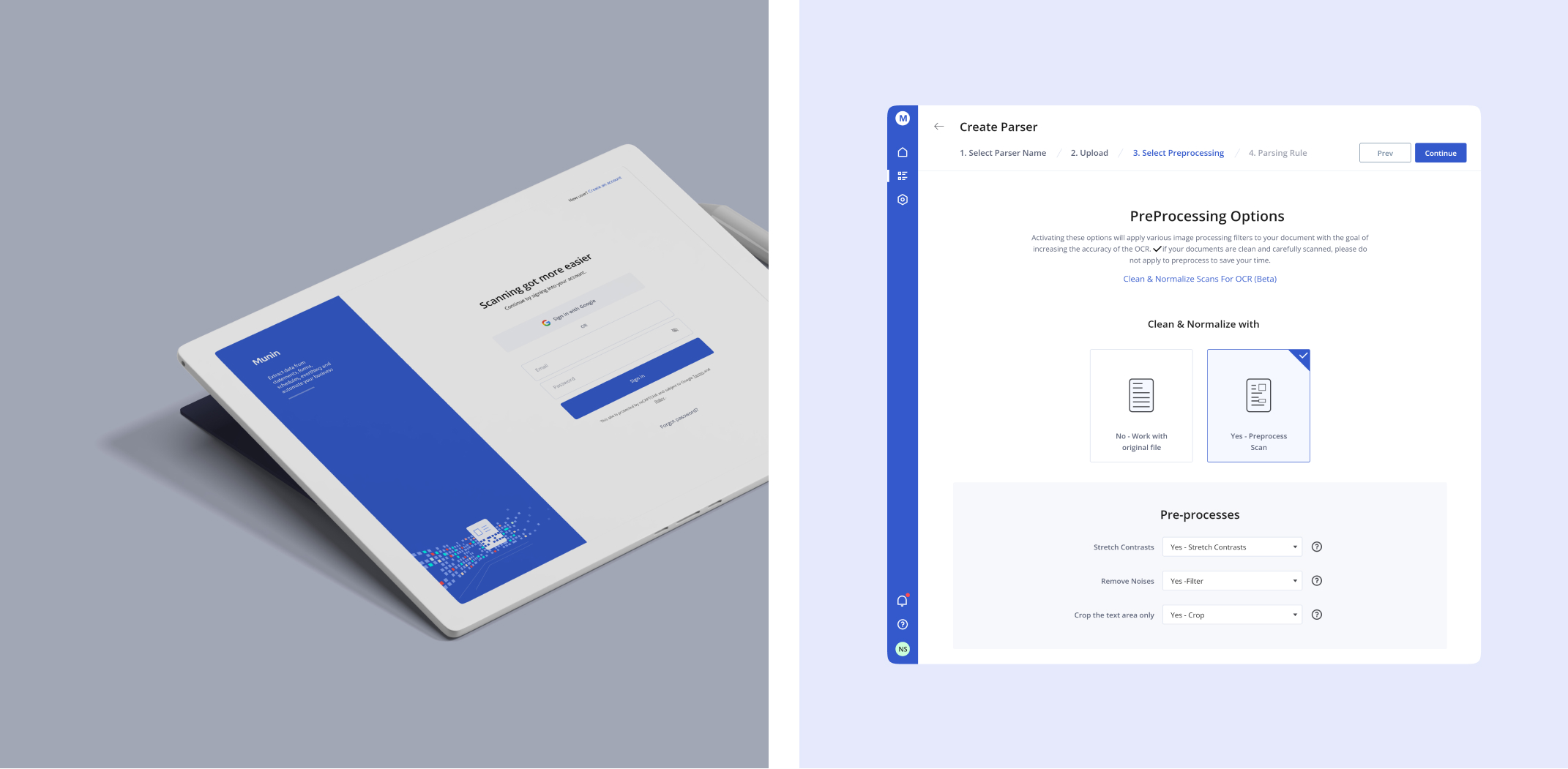
The user interface for the parser I created is seen above. I used a progressive form filling method to let users see the state and prevent errors by providing information.
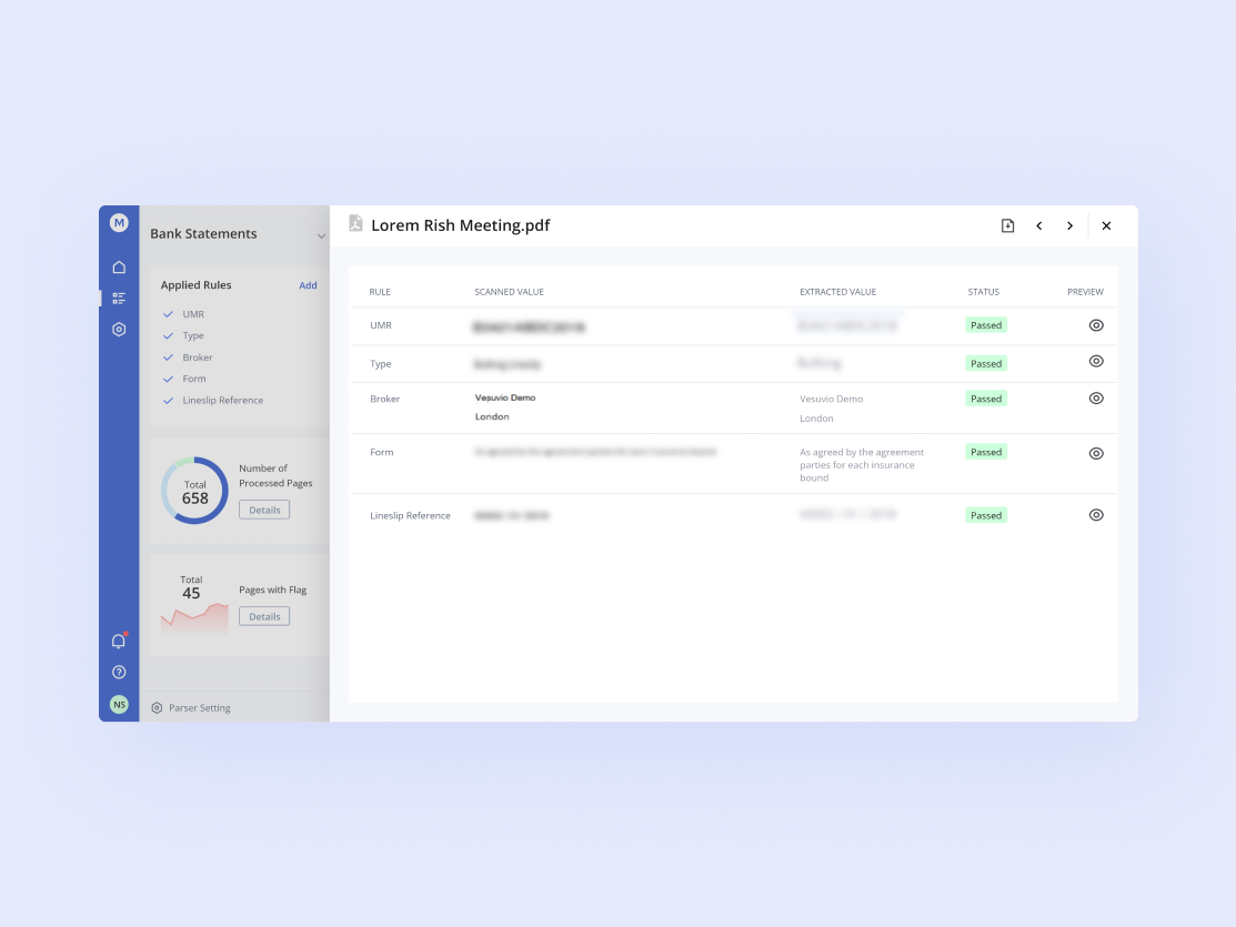
The user may scan the rules status in this slide popup, and for improved usability, I've added the prev and next options in the upper right section.
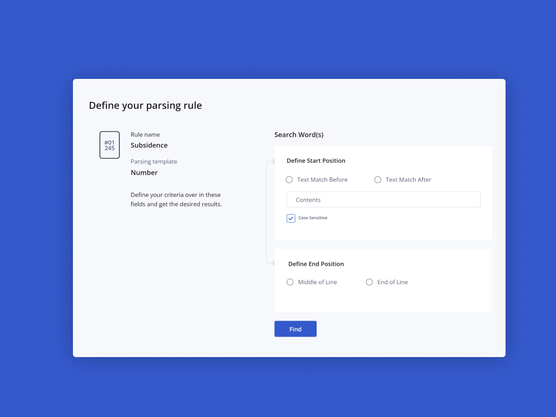
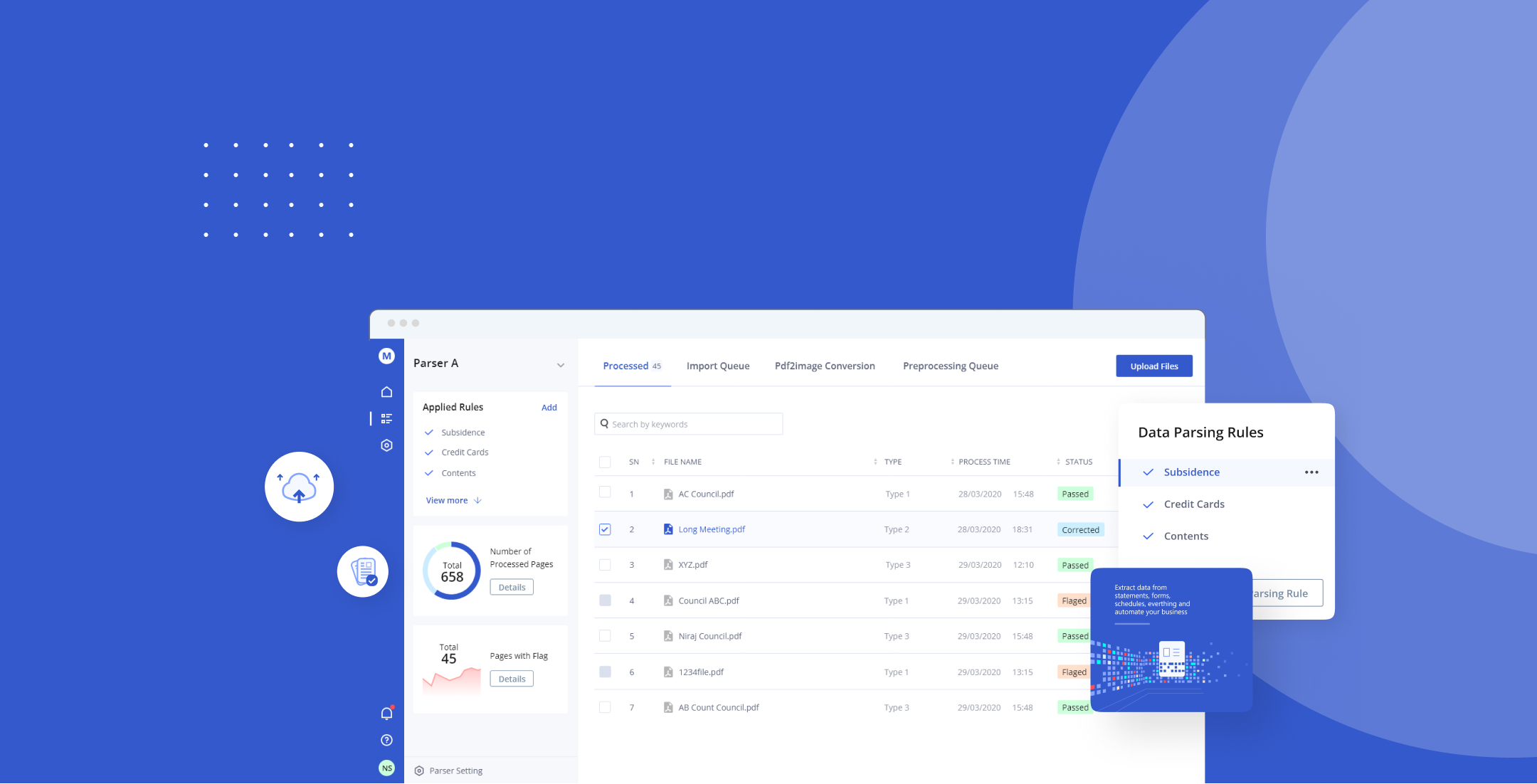
Overview of the parsing page area, which allows users to quickly search for specific document parameters.
A small data preparation interaction that I made using only HTML5 and CSS3. Micro-interactions are crucial for satisfying users since they let users know their state, get feedback, and experience the effects of their activities. You can get the code here codepen link
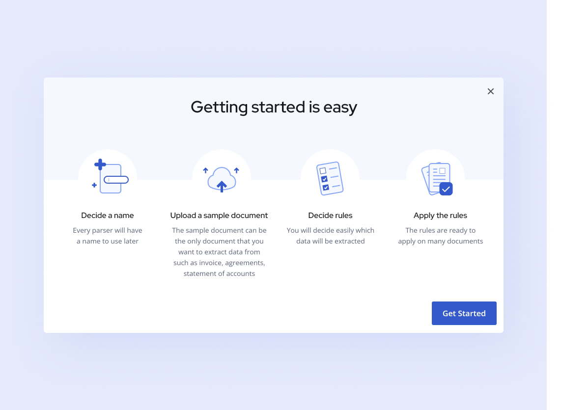
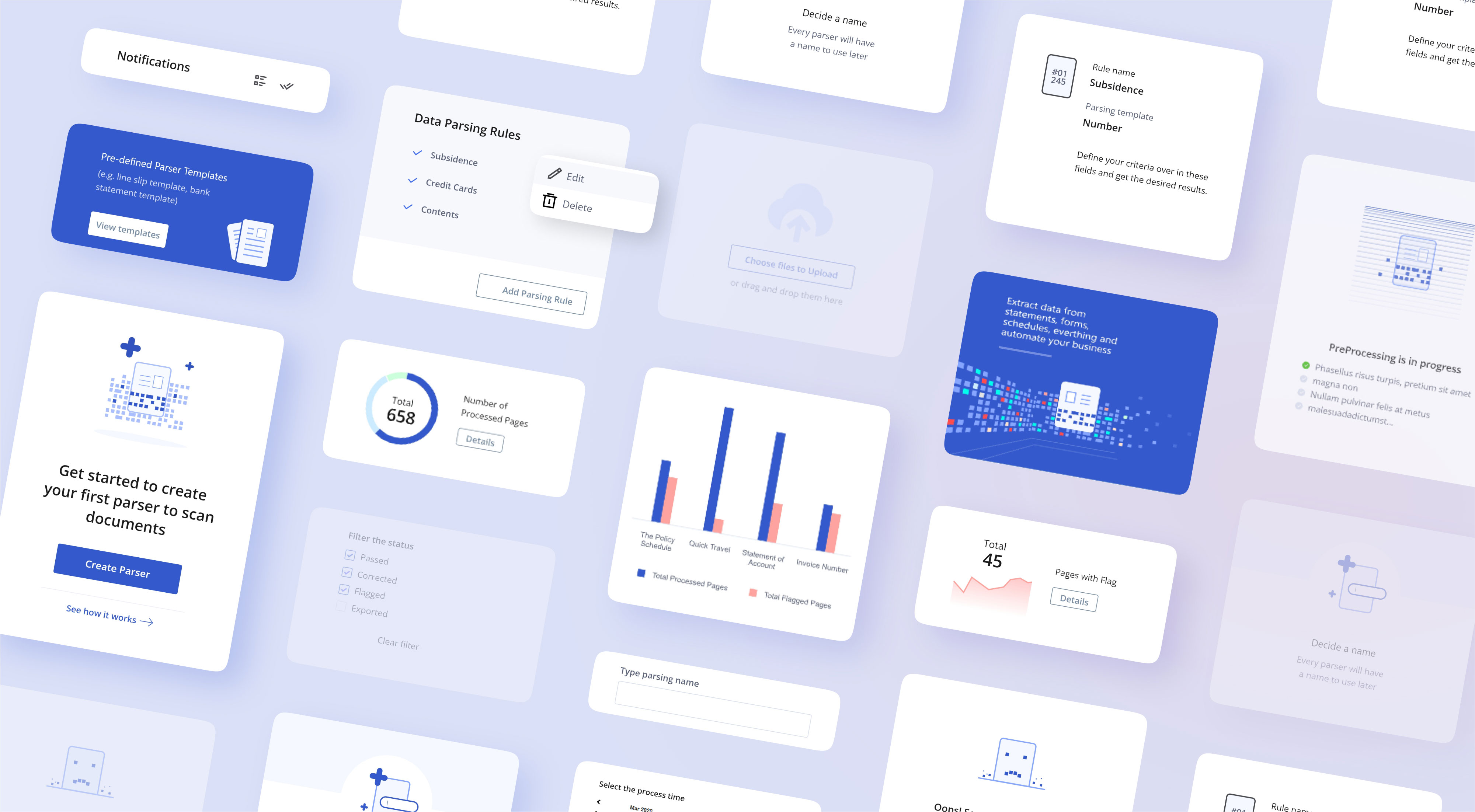
Following the approval of the entire UI, I started creating components with all conceivable states that would be helpful for development and would also help to keep the consistency for the UI design going forward.
