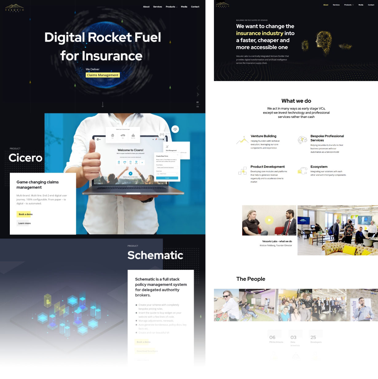
Vesuvio Labs is a vertically integrated Venture Builder that provides digital transformation and artificial intelligence across the insurance supply chain. The goal of Vesuvio is to change the insurance industry into a faster, cheaper and more accessible one. Helping founders with technical execution, leveraging its' core components and experience. Helping incumbents transform their business processes with its' Automation-as-a-Service model.
Problem
The prior website has an extremely high bounce rate. The UK market for Insurtech and Fintech is expanding quickly, which increases the likelihood that Vesuvio Labs will lose some of its clients.
Solution
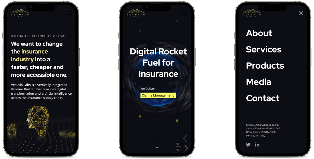
Customer retention can be achieved by creating a website with a very aesthetically pleasing UI/UX and a lot of information. Every banner, artwork, and symbol I make goes through a brainstorming process to ensure it is both aesthetically pleasing and informative. In order for the interested business owner to learn more about the products and get in touch, I had also given the "Request a demo" and "contact" sections top priority on most of the pertinent sites.
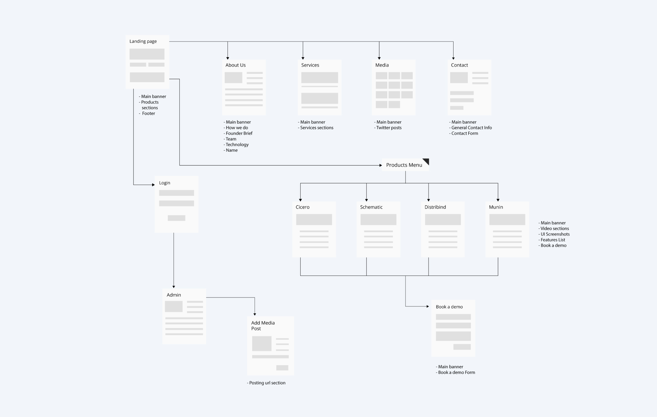
I create the visualization after gathering requirements and doing some creative thinking. With the sketches, I began. I usually enjoy beginning with sketches. I start by sketching a preliminary site map that functions as a bird's-eye view of the website. It makes it easier for me to scan the website's overall flow, and it also increases the effectiveness of getting from point A to point B. I began work on the wireframe and low-fidelity prototype once the foundational elements, such as the site flow and information architecture, were established.
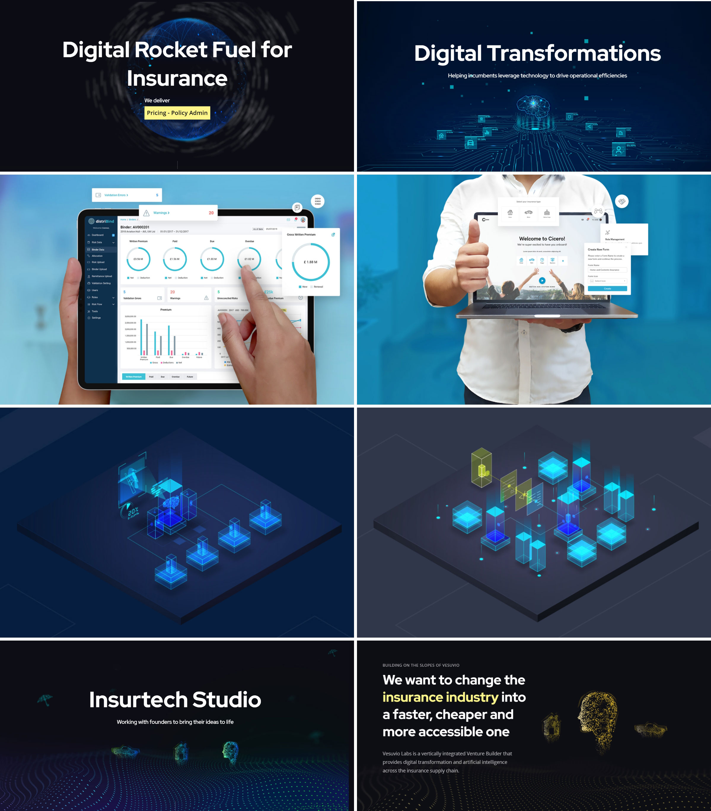
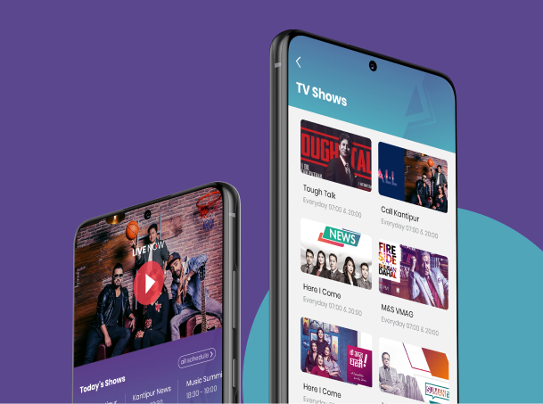
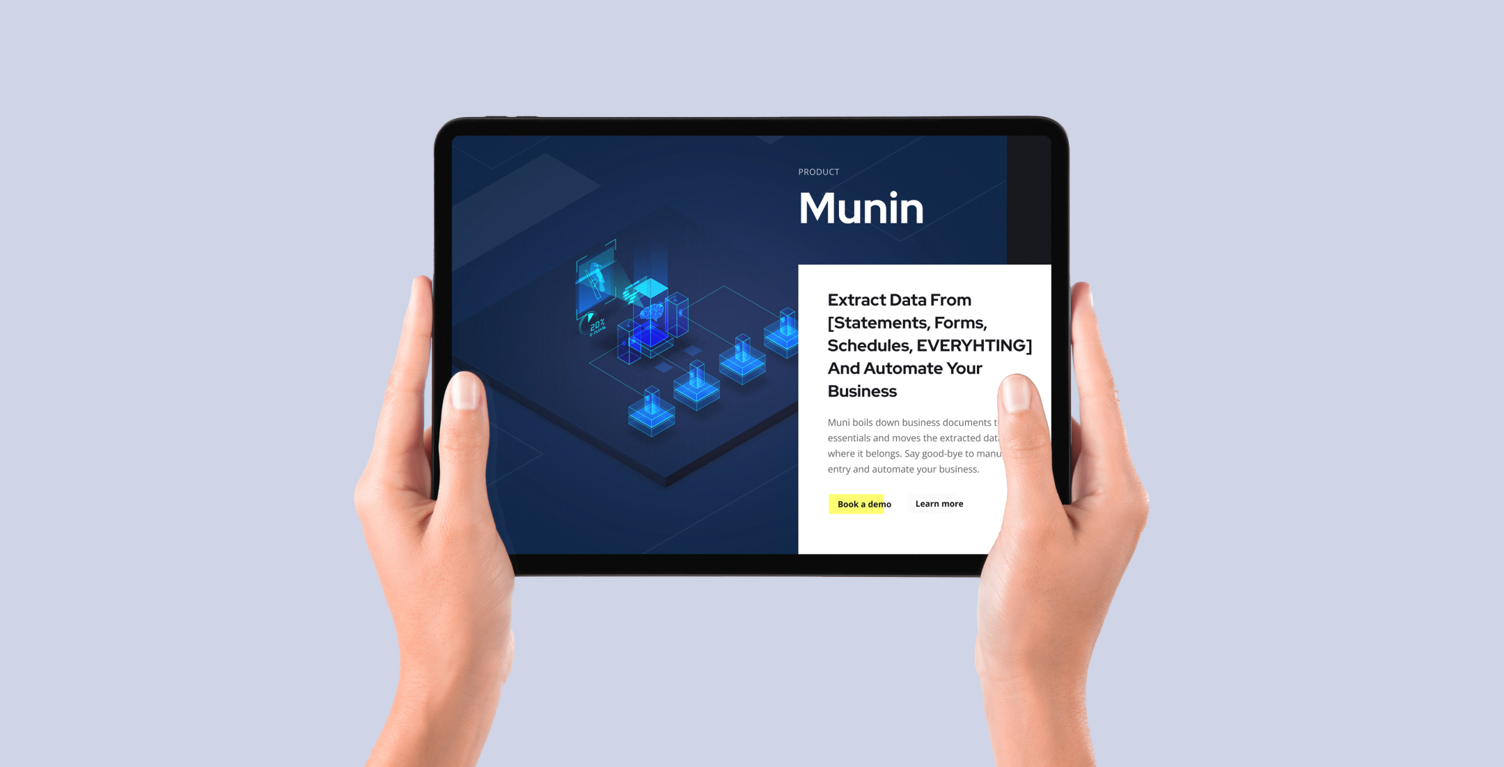
Some illustration and photo manipulation I did for the website. Everything is originally created for the Vesuvio Labs.
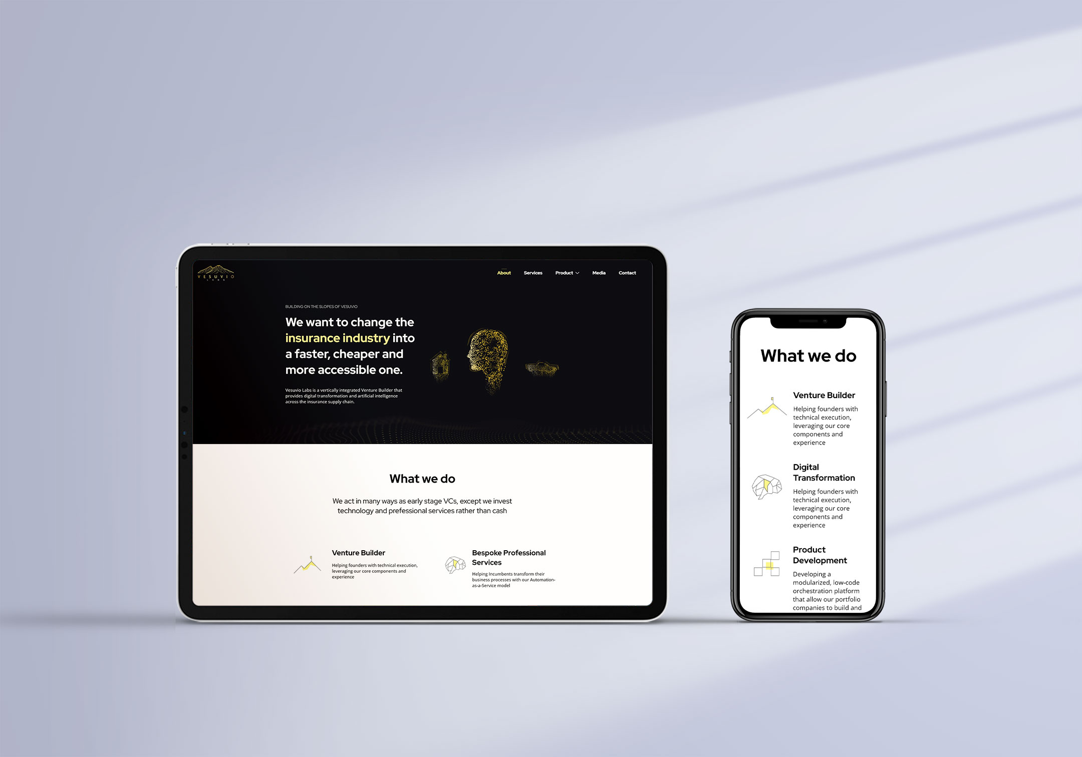
Iconography
I enjoy making icons on my own. Because you need to communicate the intended message in the 24px and 48px icon sizes, this work is both tough and fascinating. Some Icons I had made for the websites:
